

When I design I like to do a lot of research on the subject I am designing for, i like to find out the history behind whatever (or whoever) it is and then research the graphic design style that was popular when whatever it is was made. I then take influence from that graphic design and use it to create my design. In some cases I even take influence from the interior design style of the time (specifically when I am searching for colors to use). Often there are multiple different styles that were common at the time and I try to create rough designs in each of the styles in order to figure out what works strongest for the idea I am trying to convey. I don't (or at least try to not) favor one design style over another. I personally tend to enjoy every style and try to illustrate that in my work through exploring lots of different options like I mentioned before.
I like to try to balance my self-expression with the needs of clients through my ideation process, like i have mentioned previously. I enjoy being able to explore many different options and show them for consideration. As usual I typically have my favorites but they sadly aren't always selected to move forward in the design processes.
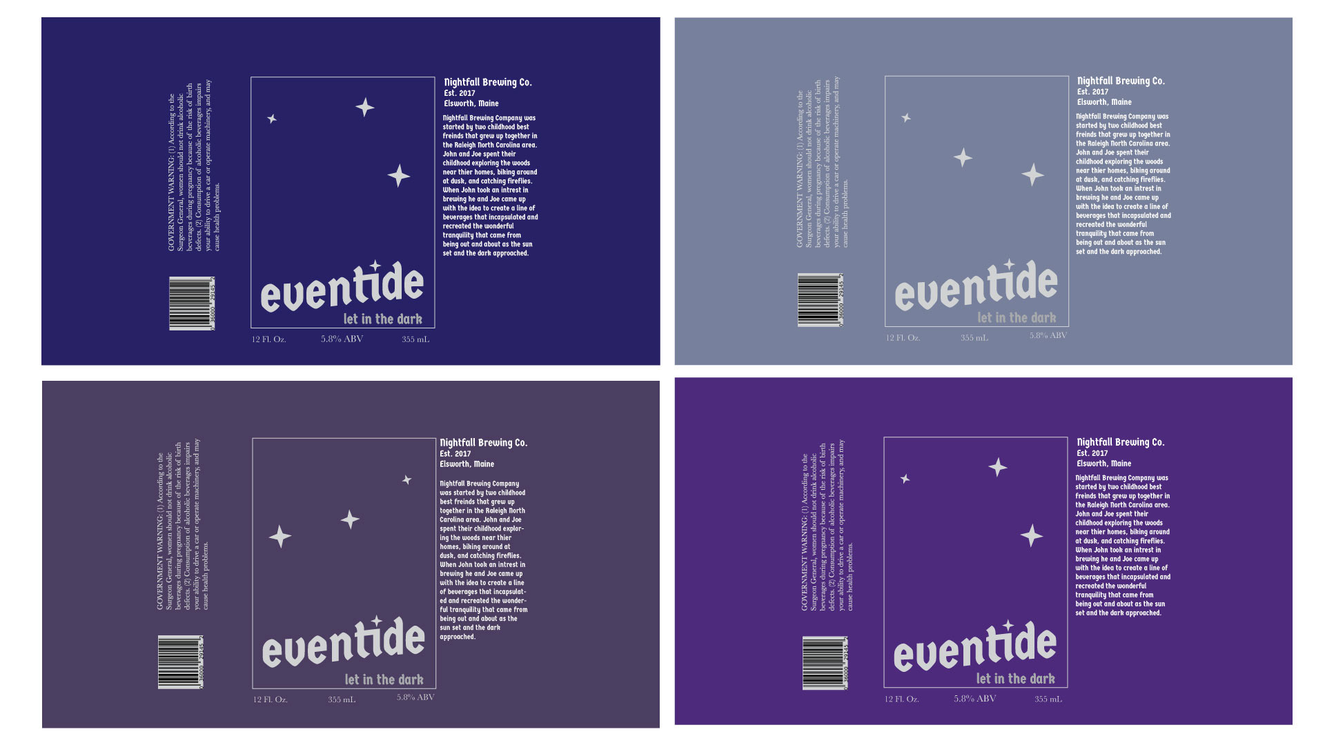
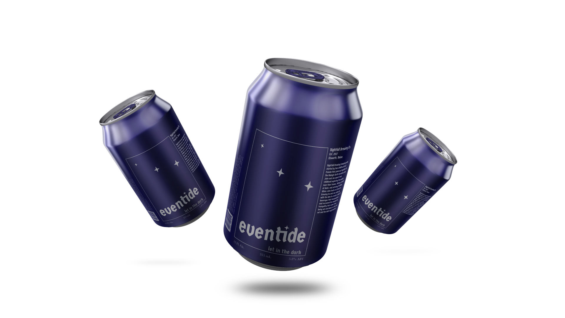
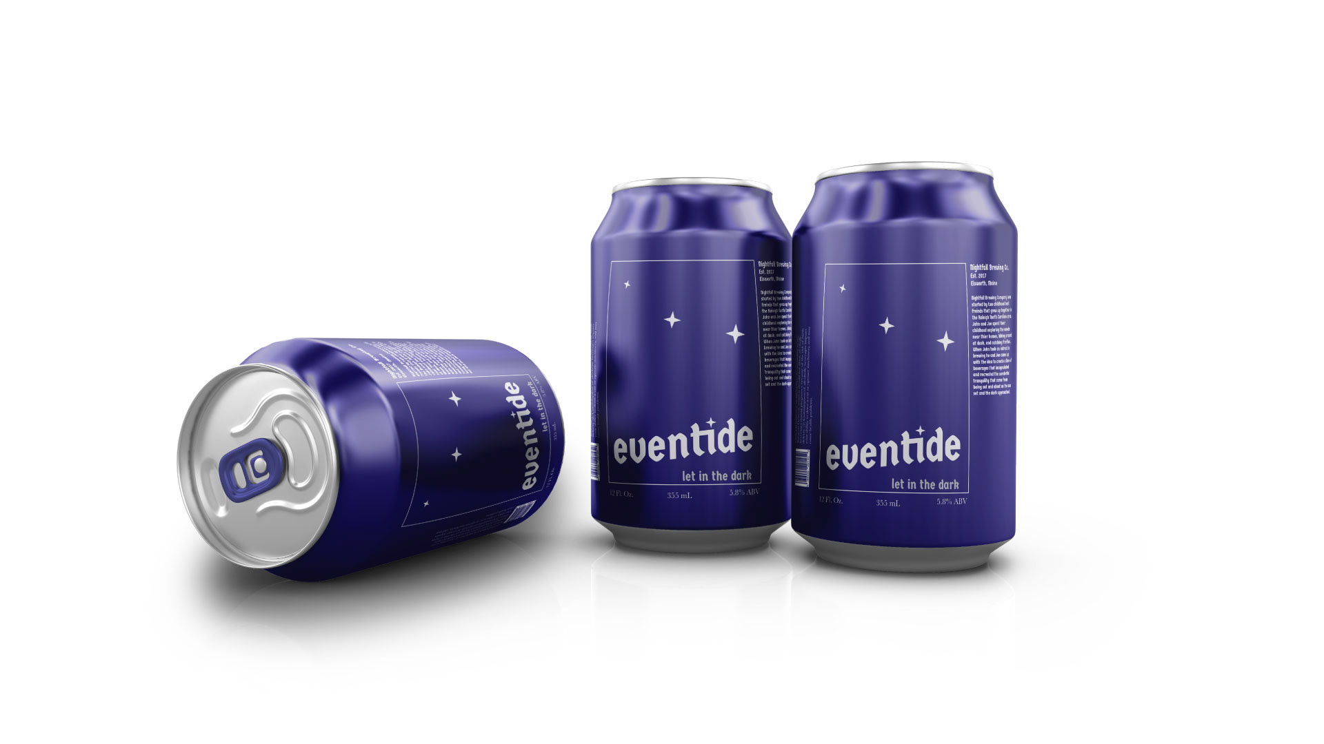
With branding the main elements I feel are important are having a clear and concise color palette that is eye-catching and communicates the desired emotions effortlessly. Without a strong color palette to tie everything together the rest of the work can be left trying to feel concise.
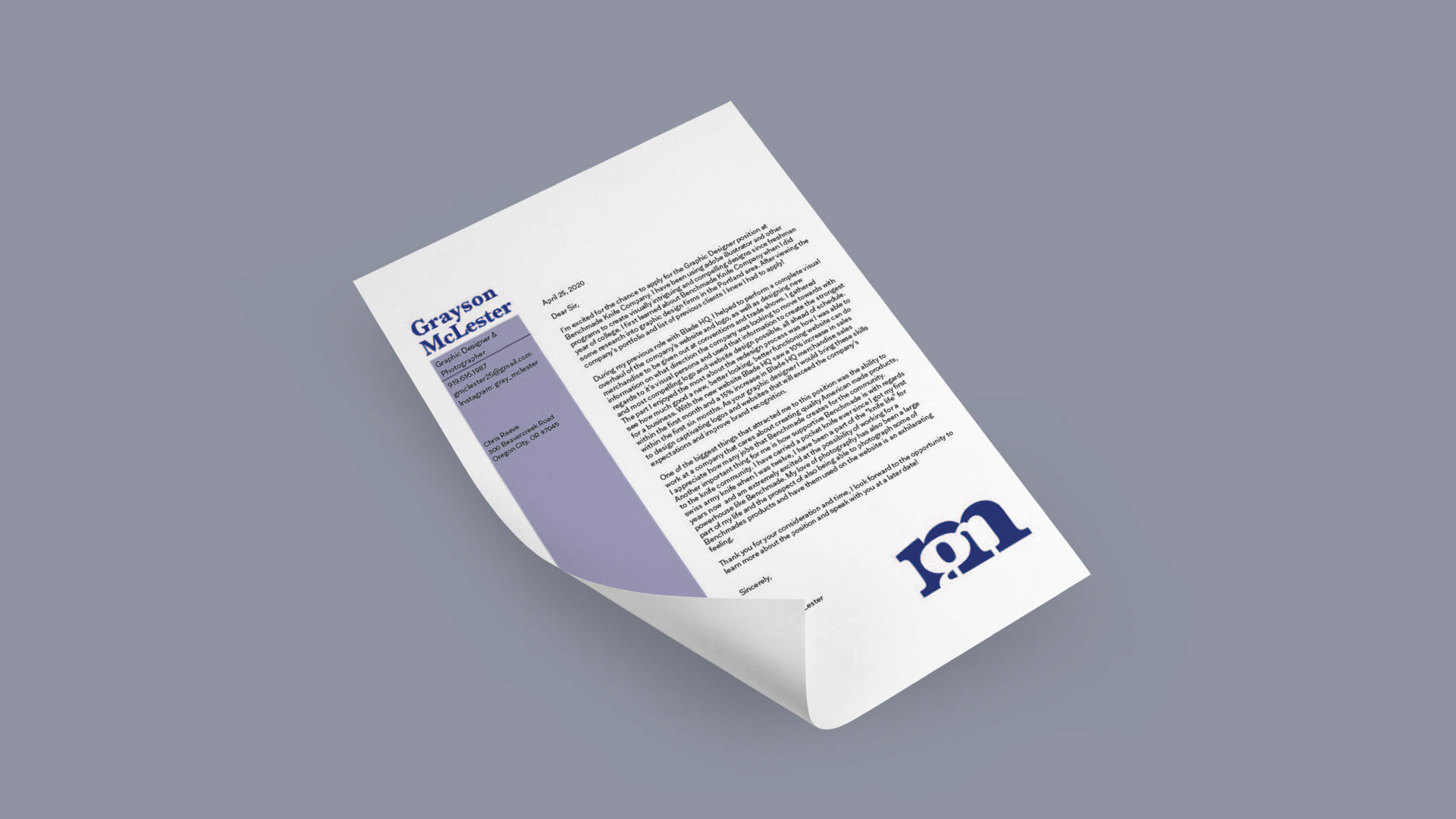
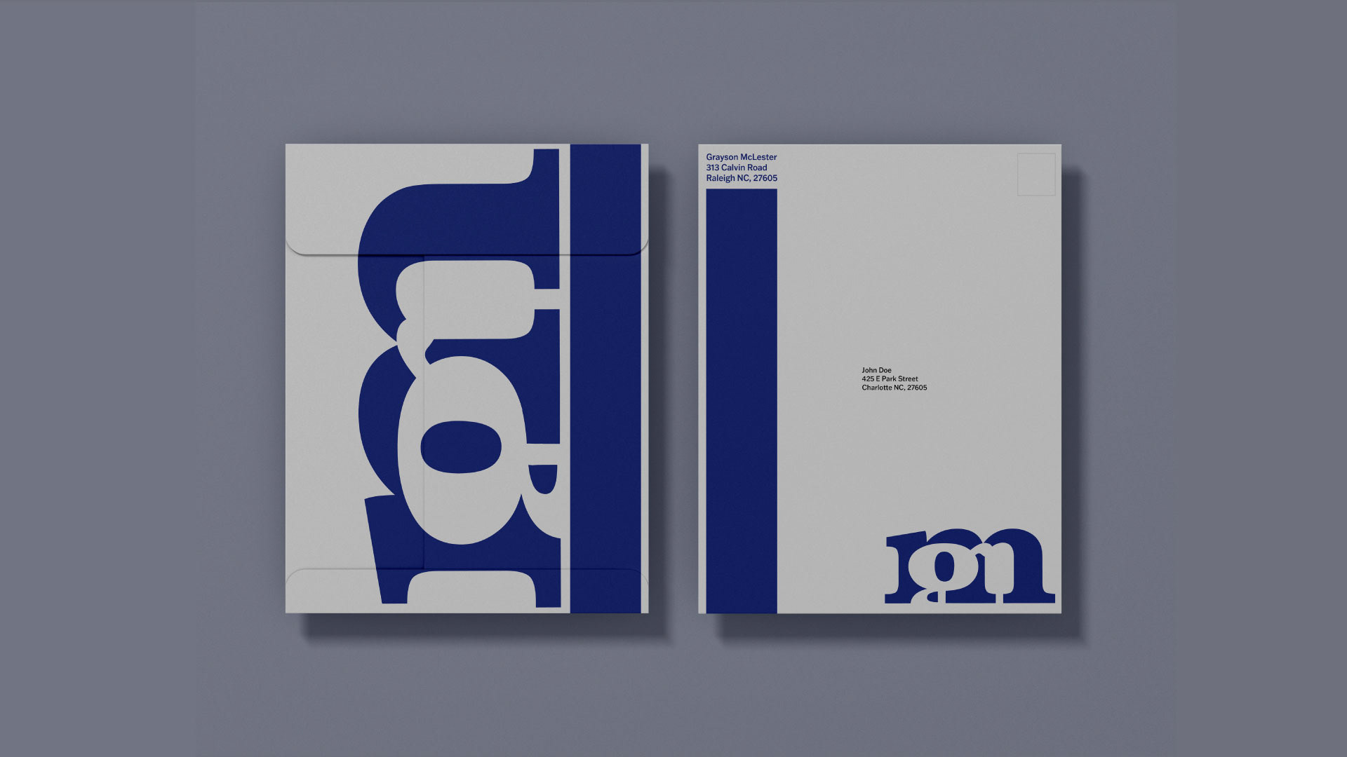
When it comes to the issue of type vs image in a work i feel that i likely tend to lean towards the image side thanks to my photography background, I tend to use text as a supporting character that helps to further illustrate the personality of the main character that is the image.