

I first became interested in design when I was in middle school. I was particularly interested in album cover art and the accompanying booklets. I was fascinated with the way that the images and type on a piece of paper could convey the mood of a song despite print design and music being two completely different means of communication. I started making my own fan designs based on music, tv, and film soon after.
Design is uniquely challenging, because it’s essentially a way of problem solving. I try to evaluate what is required of a design and what it needs to communicate at the beginning of a project. All of my subsequent design choices are based on that idea. As I move forward with different iterations of the project, I tweak and improve by questioning if the decisions I have made are truly the best choice for accomplishing the project’s purpose. I seek a balance between decoration and design. I want my designs to feel unique, but decorative elements need to serve a purpose even if it’s minute.
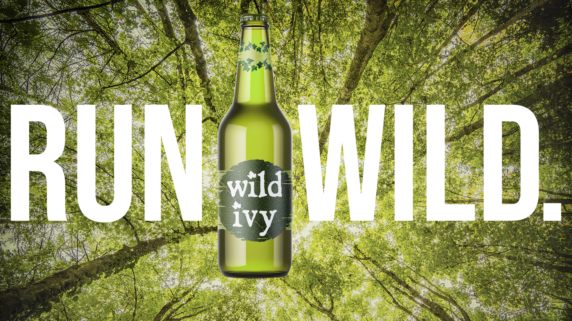
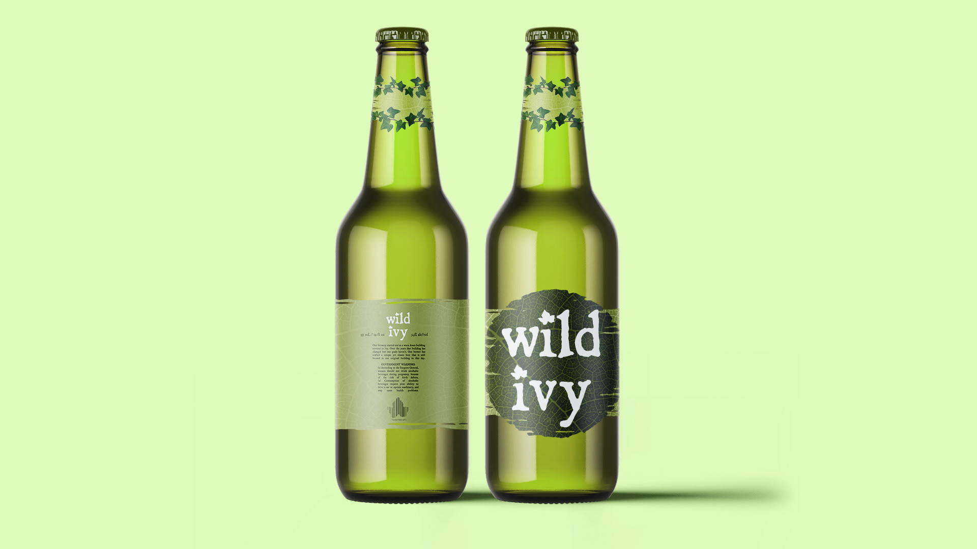
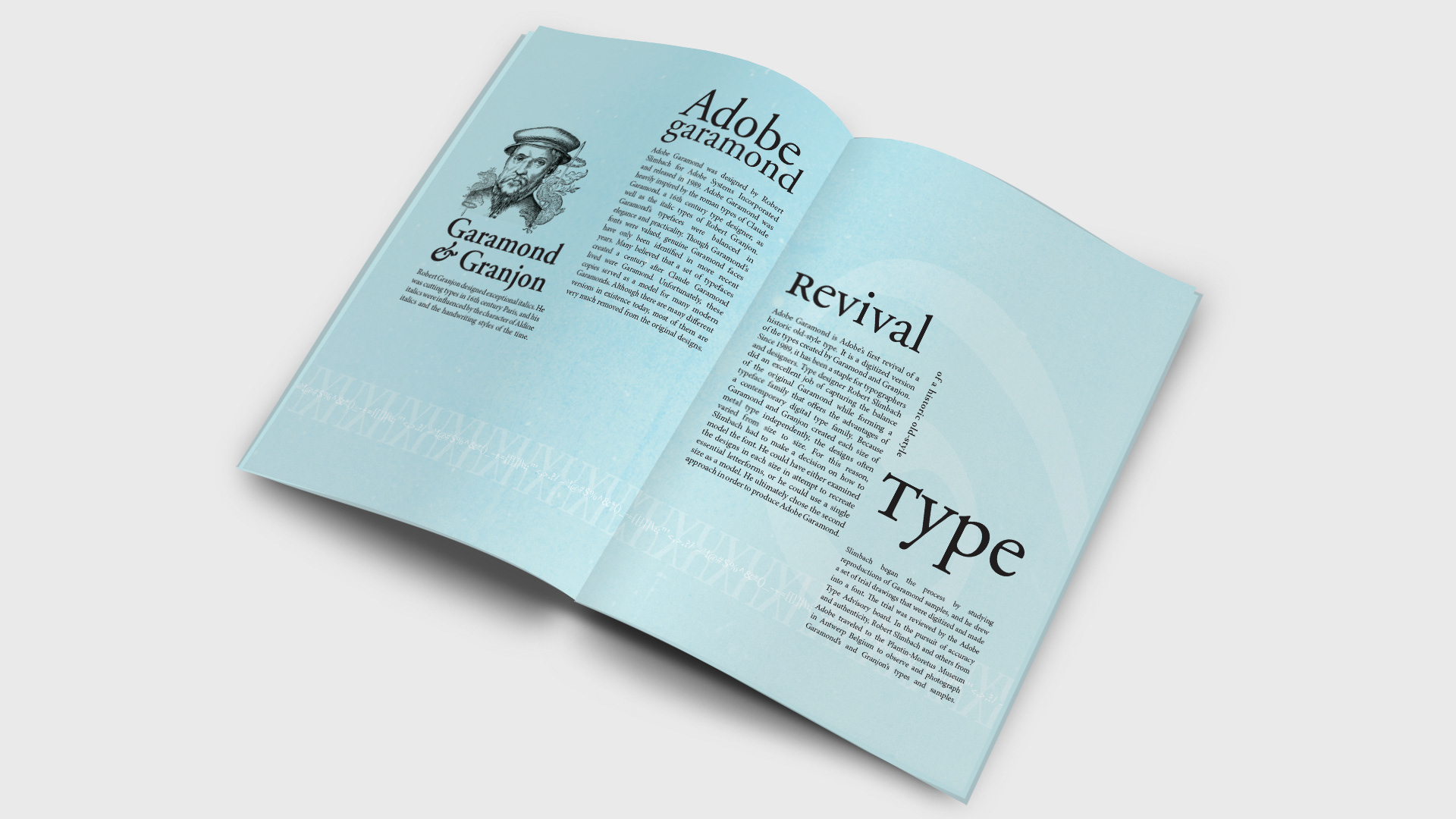
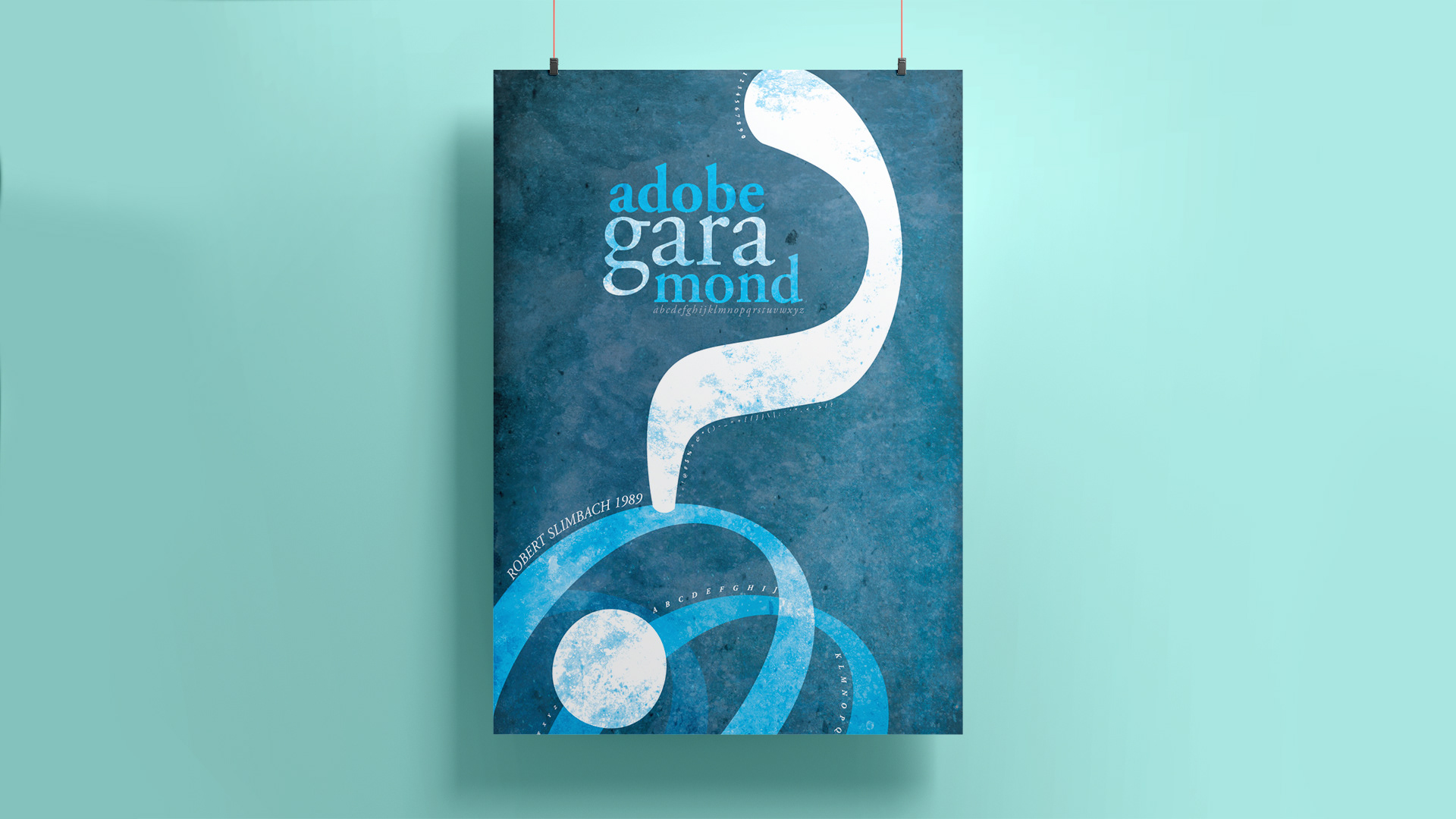
As a designer, I find that I am very drawn to textures and imagery in my work. The beer branding project and the typeface poster and magazine project both gave me a chance to play with texture in a way that was really interesting to me. My beer was titled “Wild Ivy” and I wanted to create a feel of something that had been lost in the forest and overgrown by ivy for an extended period of time. The label on the bottle is modeled after an old wooden sign that has rotted away in pieces, and the billboard advertisements further the concept through the use of worn grainy textures and natural tones. For the typeface poster, I used several different images to achieve the worn paper texture. I wanted it to seem old, because the typeface itself was inspired by classic typefaces created by Claude Garamond in the 16th century. I believe that type and images can and should work together in a way that furthers the effectiveness of a design. I aimed to create a clear relationship between the type and imagery in the poster and in the magazine spreads.
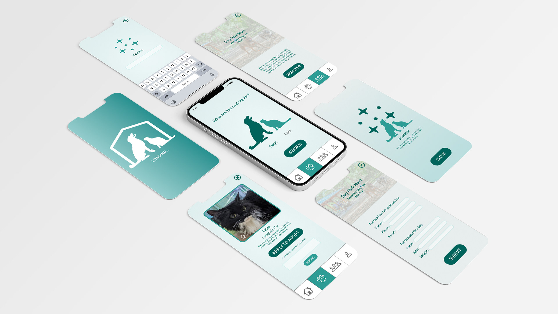
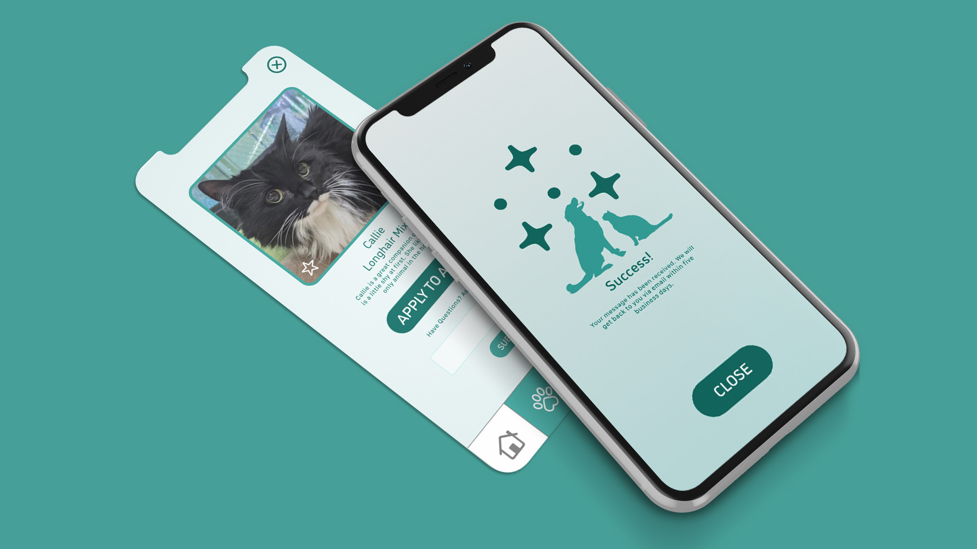
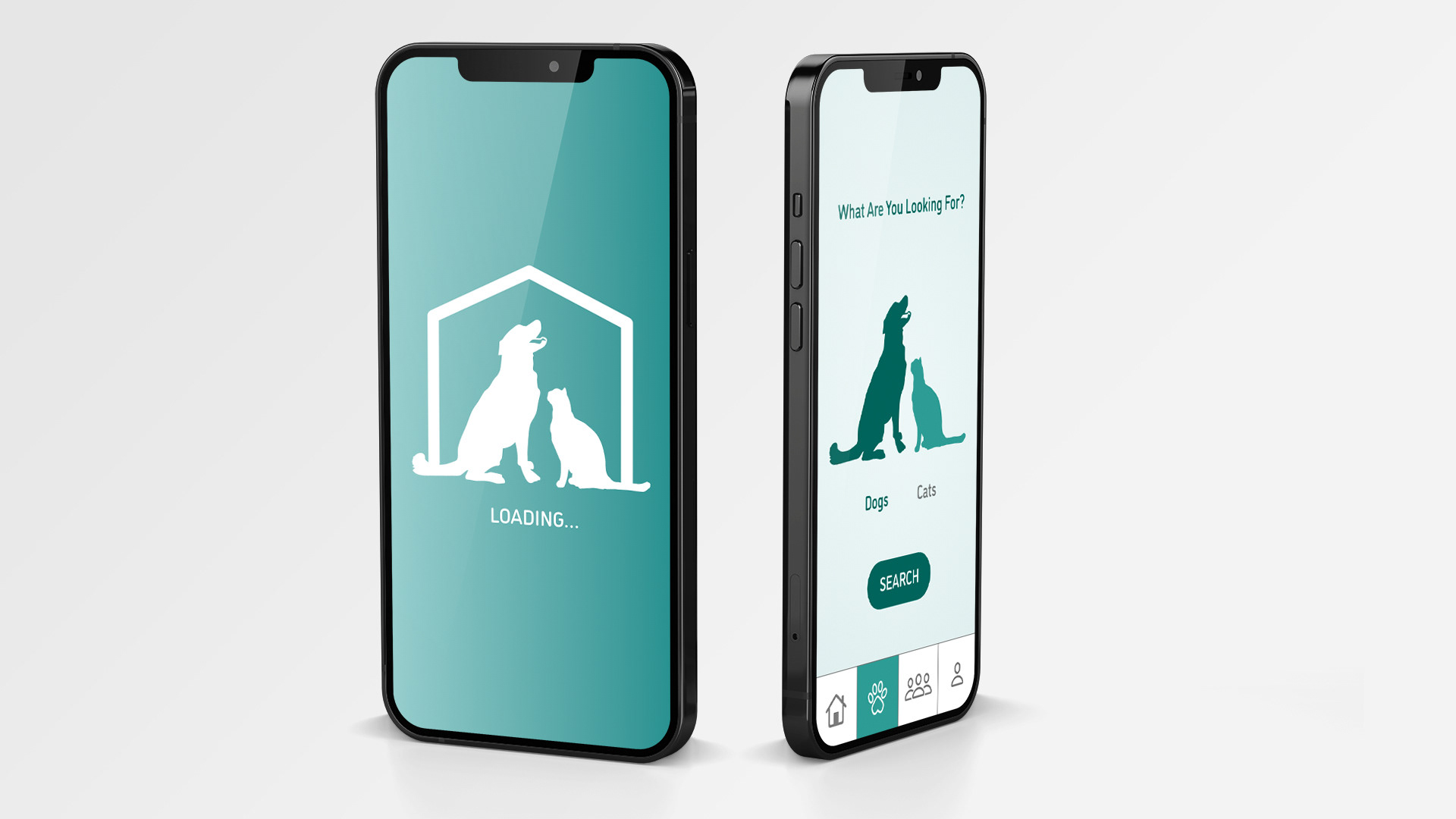
Creating an app was interesting because I had to find a way to make multiple screens feel interconnected and intuitive. I knew I wanted the app to be cohesive which required repetition of certain elements on each screen. I chose to repeat rounded shapes, blue tones, and gradients throughout the app which created a feeling of unity.
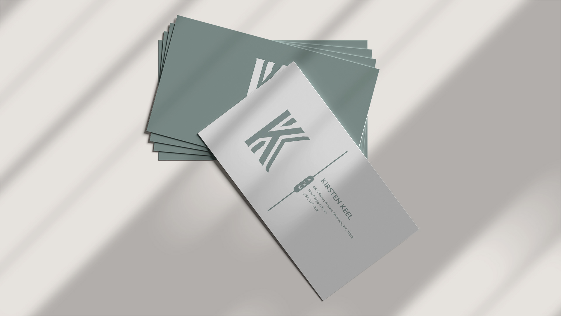
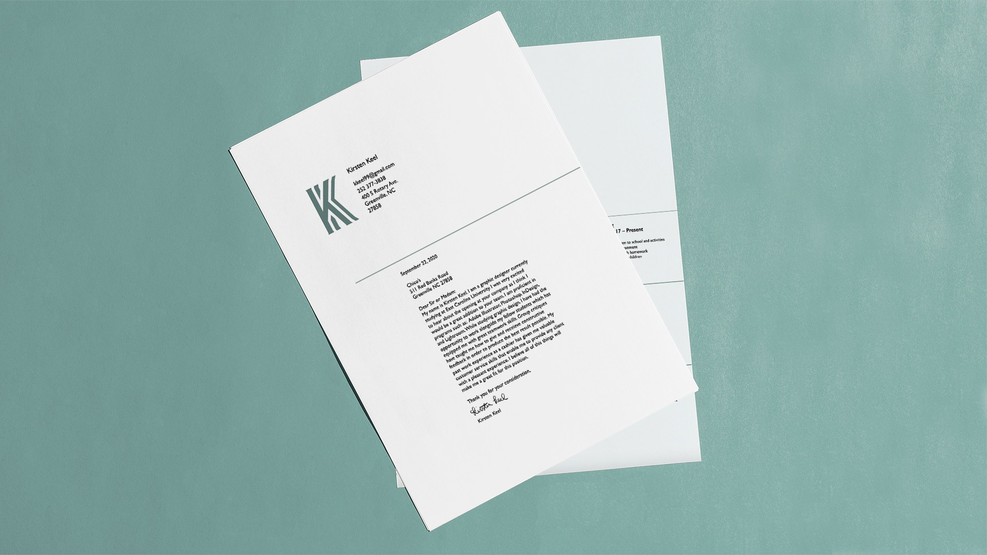
When designing my personal mark, I felt it was important for the design to be representative of both me as a person and me as a designer. The typeface I used is a rather simple sans serif, but it features some unique terminals that flare out. I felt that this was more interesting than a basic sans serif. I chose a muted, soothing color because it’s the type I most gravitate towards. I also knew the mark needed to be legible and distinctive at both small and large sizes, and I made decisions based on that goal.
@kirkeedesign
keelk17@students.ecu.edu
keelk17@students.ecu.edu